MacBook 12 keyboard fiasco

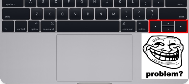
I love you Apple and all, but honestly I don’t know dafuq was it with the person who approved this keyboard – namely the keys for up/down/left/right. I mean, have you ever used this?! Like, in real life, no just an image in Photoshop?!
Jeez, imagine typing on a full scale size keyboard for 20 years and now, what do you know, someone makes this utter garbage, arrrgh! On one of my previous laptops (HP G6) they made the same mistake and never went back to it again.
I didn’t like the small movement keys on Air either, but that was manageable since all were the same size, but with this – tears and pain :/
I see people hitting the SHIFT key waaay more often now :/. Blame the 20 year muscle memory 😛
On the bright side of life, iWatch looks nice – we’ll just have to wait a bit longer till they do something with the battery.


Are you insane? I’ve been waiting for this feature forever! Macbooks always used to be minimalistic and perfect, but this design horror spoiled it all. And what a hell are you talking about usability? These keys are way better than old ones. Now I’m looking forward to release of Macbook Pro with the same keys.
Well, I guess it’s as they say, “you can’t argue one’s taste”. I personally really don’t like them, but it’s good to see that there are people that do. Diversity FTW 😉