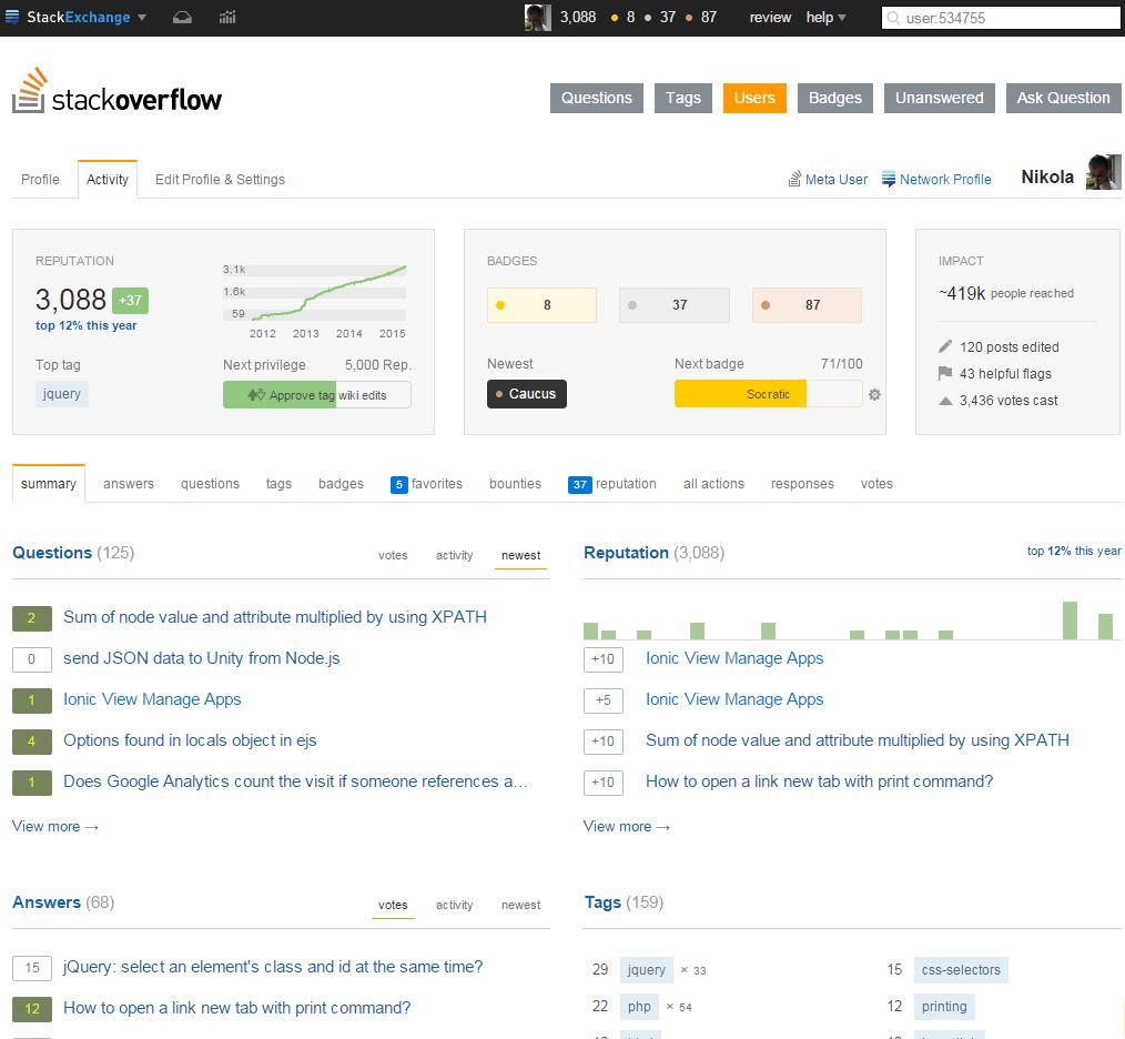
New shiny StackOverflow profile page

StackOverflow updated the users profile pages, which now look awesome:
It’s way cleaner now. All in all, thumbs up from me, and as it seem, most of the community. You can read more about it on their blog.


Leave a Comment